German data visualization specialists seek iPhone tracking data
A Berlin team is asking iPhone users to donate their tracking data as a
way to make a bigger map of WiFi and mobile phone towers all over the
globe. So far, they have several hundred sets.
Late last
month, Apple responded to the revelation that its iPhone and iPad
products track their users' movements across mobile phone networks and
WiFi networks around the globe.
Two British
researchers had previously described at an April tech conference in
California how this tracking data was being stored in an unencrypted
file on the phone itself. They also wrote a data visualization program
so that any iPhone owner could diagram their data on to an
easy-to-understand map.
In a statement
published to Apple's website, the company said users were "confused"
about what exactly the company was doing with this data, adding that it
had never tracked anyone.
However, in
response to all of this, two German data visualization specialists are
now asking for volunteers to donate their iPhone data as a curious
project, known as Crowdflow.net, to map what these iPhones actually
know. To learn more, Deutsche Welle spoke with one of the project's
founders, Michael Kreil.
Deutsche Welle: What are you trying to do here? What's the ultimate goal?
Michael Kreil: The funny thing is that we don't have any goals.
Because it started somehow with a scientific project. It started first
when I analyzed my own iPhone tracking database. And I made a small heat
map of Germany and all the places I've been to. And someone else on
Twitter posted his database and so I took his data and visualized it too
as a heat map of Germany. Then I had the idea that it would be
interesting to take these two databases - his and mine - and to measure
for example, at which time and which places we've been quite close to
each other.
For example, last summer, we've been just 400 meters, roughly, apart
at a demonstration, and then at a conference, we were 700 meters apart.
Then I had the idea -- what would it look like to combine thousands of
such databases and compare them, and what information is really in
there?
It sounds like that at this stage, it's mostly curiosity more than anything else.
Yes, it's just scientific curiosity more than anything else.
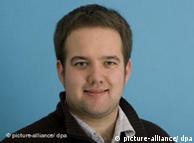 Kreil also contributed to the visualization of Malte Spitz' (picture) mobile dataNow, you worked on the data visualization with German politician Malte Spitz, right? Kreil also contributed to the visualization of Malte Spitz' (picture) mobile dataNow, you worked on the data visualization with German politician Malte Spitz, right?
Correct, yes.
I interviewed Mr. Spitz about this visualization a few weeks ago.
And that was such a great visualization. Is that what you're hoping to
do, the same interface, or are you thinking about doing something
different?
The idea behind data journalism is take the data, look into it, and
try to find new relations and new knowledge, and then publish it. We
don't know if we will publish the data in a web application, in a way
that we did for the data retention from Malte Spitz.
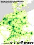
Right now I'm looking at your blog, and it says this is from May
1, and it says ‘First database dump of cell and WiFi stations,' and
there's a darkened map of the globe, and there's a bright spot in
Germany and Europe, and there's a few in the US, and there's some in
South Asia and one in Australia. What's been the distribution of data
that you have so far?
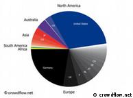
Currently we have roughly 700 iPhone logs, and they're still growing.
We hope that we collect more - perhaps thousands of such log files. And
currently we have a lot of data from Germany, as this project started
here, and we have a lot from Berlin. But the database is still growing
and hopefully we will cover a lot of cell stations and WiFi stations in
America and in other countries in Europe. And we also have a lot of data
from Australia and Japan, and even India. We'll see.
It sounds like you don't even know where this data visualization
project is going. Is that how a lot of data visualization projects go,
that you learn something through the process?
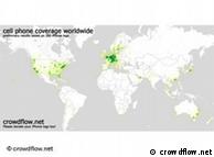 Crowdflow.net aims to reach the entire globeWhen
you combine a lot of data, you never know what kind of information is
in data. Maybe you have one data set, which has a lot of information
[but you don't know what it is], and you have a second data, also with
no information, but at that point where you combine them, you can see
what kind of information and correlations are there. That's the
scientific part. The journalistic part is to combine and look and see if
there is any knowledge or information there. Crowdflow.net aims to reach the entire globeWhen
you combine a lot of data, you never know what kind of information is
in data. Maybe you have one data set, which has a lot of information
[but you don't know what it is], and you have a second data, also with
no information, but at that point where you combine them, you can see
what kind of information and correlations are there. That's the
scientific part. The journalistic part is to combine and look and see if
there is any knowledge or information there.
You can't say that ‘we want to prove that the mobile coverage is
bad,' or that ‘Apple is tracking us.' You can't prove that because you
don't know what's in there. You have to collect it, dig through it, and
then you can see what's there.
So, in other words the story emerges from the data, and not the other way around?
Yep, definitely.
Now if I send you my data, is there any way to tell that this data came specifically from me, and specifically from my iPhone?
The correct answer is, I don't know. For example, [a few years ago]
AOL released a bunch of data about search engines, and [it was later
shown] that they could be de-anonymized. And [later] there was another
example - Netflix.
They matched the Netflix database with the IMDB database. Then they
can see that these people liked these movies and hated these movies. And
then there's also accounts on IMDB with the same profile, so probably
these people are the same. So they use the IMDB data to de-anonymize the
Netflix data.
 For now, the US and Germany are the biggest sources of this iPhone dataThere's no way of telling if it's possible to use the track data to de-anonymize these people. I'm not sure, we don't know. For now, the US and Germany are the biggest sources of this iPhone dataThere's no way of telling if it's possible to use the track data to de-anonymize these people. I'm not sure, we don't know.
We started off that everybody can add their name to their log files.
For example when we make a social visualization, that we can make some
kind of a social structure. Currently we are saying that you can say
that you're sending us the data anonymously, but we can't ensure your
anonymity.
In other words, it sounds like what you're saying is that you're not sure if it can be fully de-anonymized or not.
We can't guarantee that it won't be de-anonymized.
But if I send you my file right now, is there any obvious way to know that it came from me, specifically, Cyrus Farivar?
We are deleting our logs and we're not tracking IP addresses and
stuff. But you never know. Sony was hacked twice. If someone is hacking
us and all this data is released, I just don't know. I try to make clear
that we do all we can do to ensure anonymity.
Interview: Cyrus Farivar
Editor: Sarah Steffen data visualization
http://www.dw-world.de/dw/article/0,,15062976,00.html
|